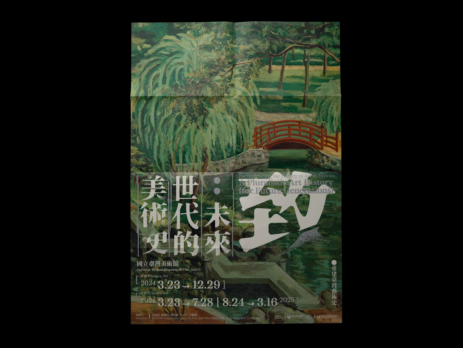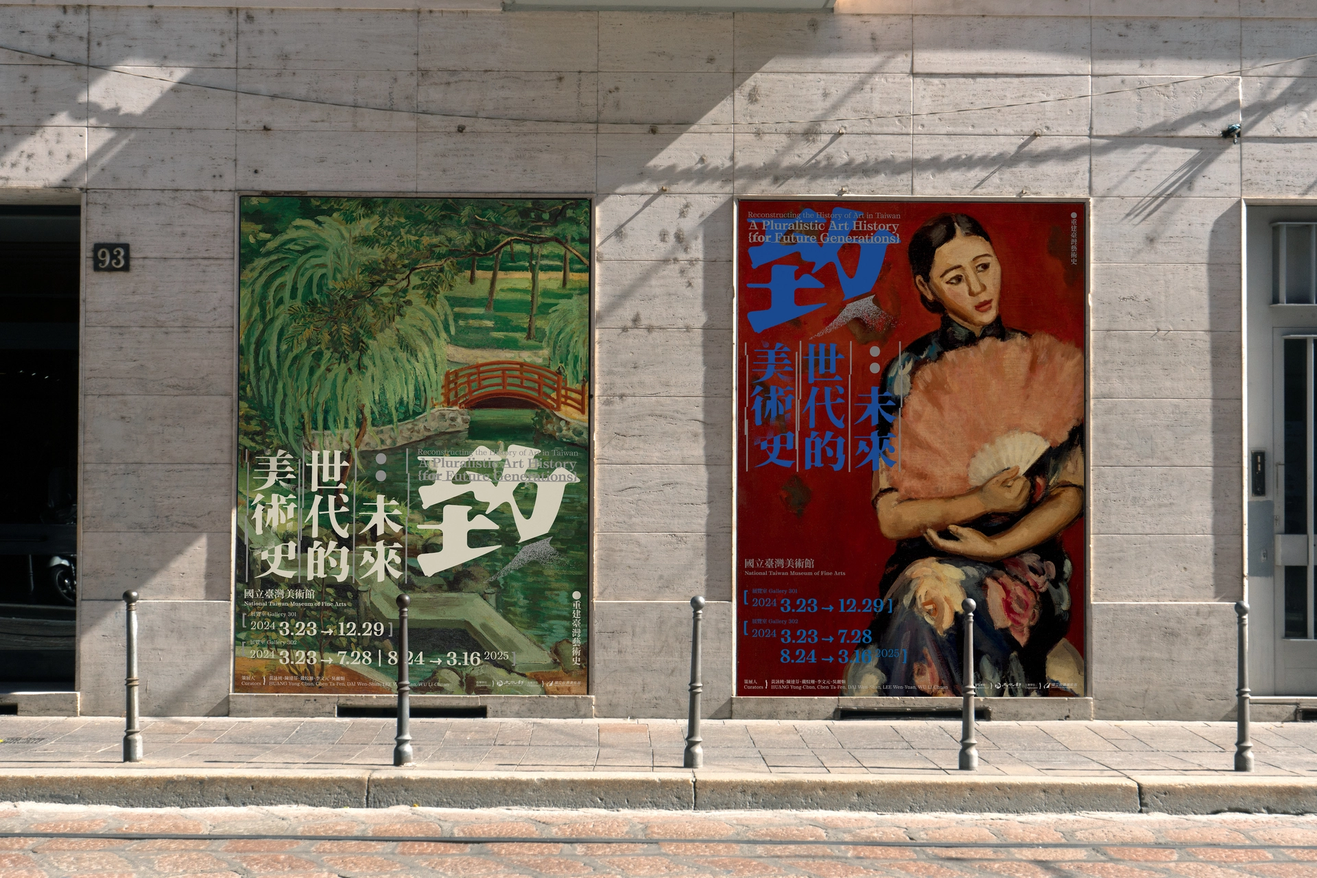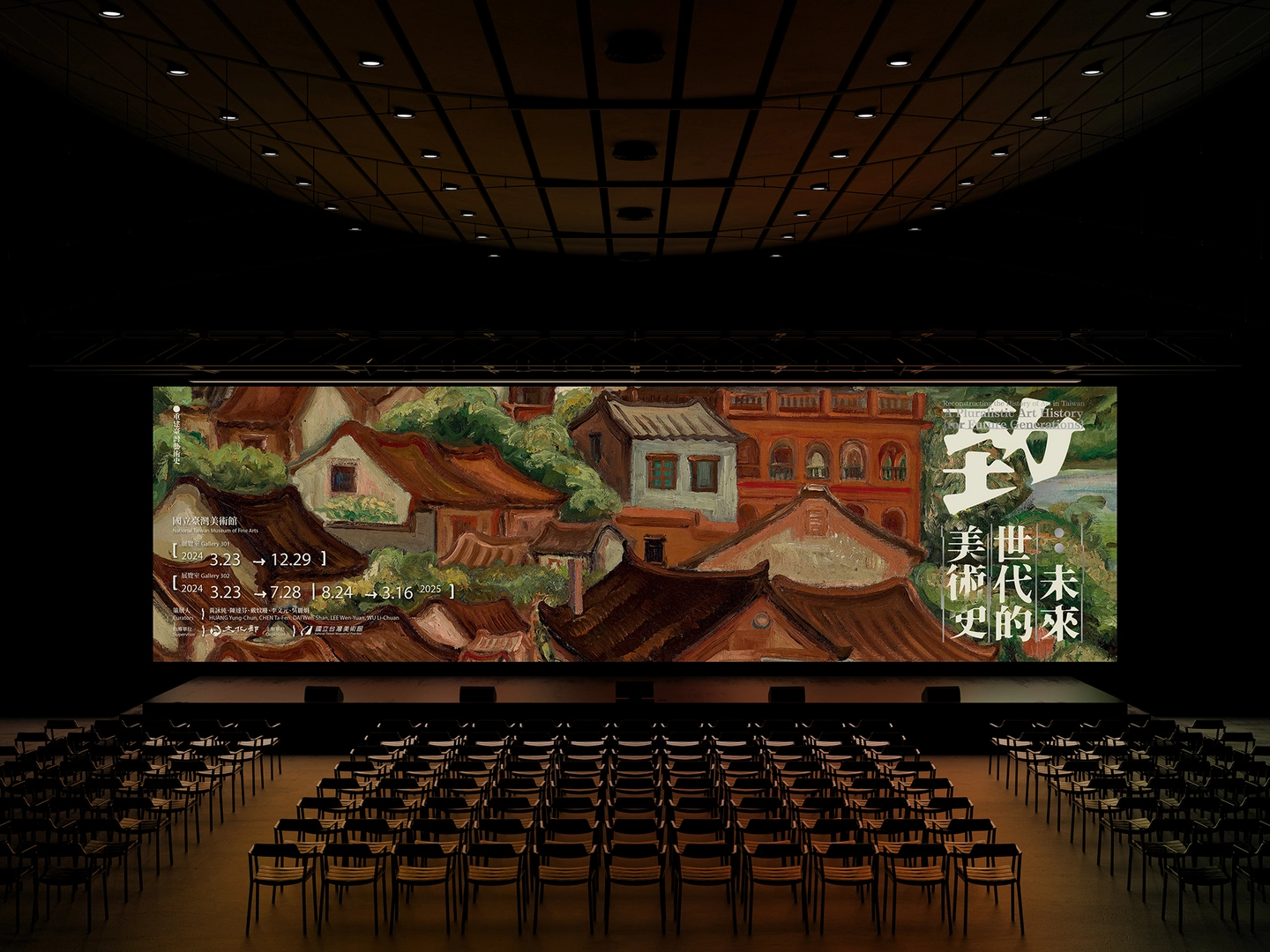
致未來世代的美術史
Reconstructing the History of Art in Taiwan A Pluralistic Art History
CL | TaiwanArt Museum
AD | Chunghuai Mao
D | Yuhan Tseng,
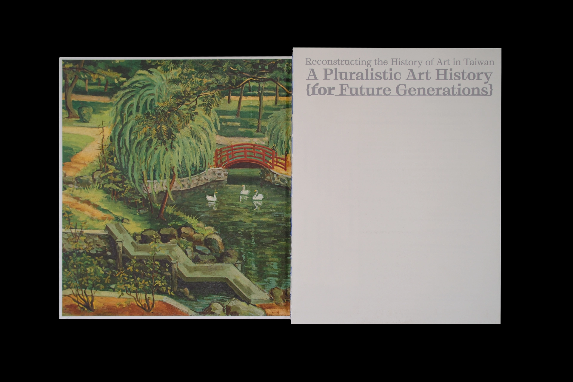
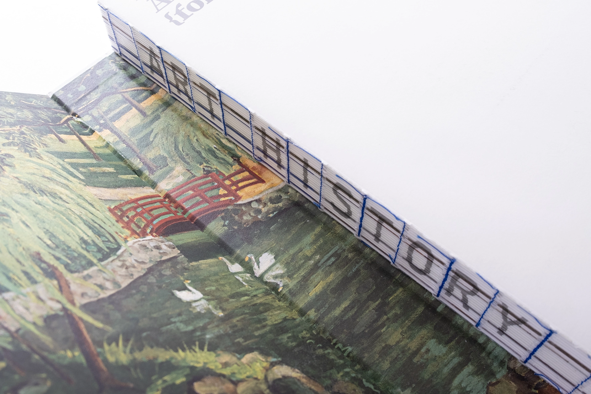
以書信、歷史和時間為主軸。標準字設計上強調不規則的邊緣和斑駁感,通過不規則的字型邊緣、斑駁感和錯位方式,以及顏色的選擇,突顯歷史的沉淀和時光的痕跡。
The design is inspired by letters written to the future. The typography emphasizes irregular edges and a weathered texture, while the grid is intentionally misaligned to highlight the passage of time and the depth of history.
Overall, this design centers around correspondence, history, and time. It creates a visually compelling and emotionally resonant narrative through irregular typography, a distressed aesthetic, deliberate misalignment, and unique color selection. The goal is to evoke a sense of history’s weight and the ever-flowing nature of time.